Cellulant is a Payment Platform Infrastructure Service Provider that creates homegrown digital payments technology for African markets. It provides the platform that powers the internet of payments with dominant market position across 12 Sub-Saharan countries.
The company was re-branding one of its digital products from Mula to Tingg and wanted a website to communicate the re-brand and communicate features of Tingg. I worked remotely with the Cellulant team alongside two other designers (Ariyike Adetimehin and Debbie Adejumo) on this project. The project was a 1-week project and the process was condensed to produce the best results given the time.
The project brief was to: "build a 5-page website that represents the Tingg Brand and uses color and design to communicate to our Consumers, Businesses and developers."
The process to achieving the goal of this project was a 4-step process, namely:
1. Understanding Tingg:Research
2. Analysing the Findings
3. Ideation
4. Final Design
To better create a website that effectively communicates Tingg's rebrand, it was important to understand Tingg's history, its product offerings, the user groups and the message Cellulant was trying to communicate to its users.
To achieve this, we conducted both primary and secondary research.
Primary Research
This was based on research already conducted by Cellulant to understand its user preferences and shared with us upon request.
Secondary Research
1. Internet search to understand users
2. Google Playstore reviews
Findings
1. Cellulant had two brands (mula and tingg) with similar products offerings and was merging these brands into Tingg.
2. Tingg's product offerings varies from country to country
3. From the Google Playstore reviews, we realised that users were comfortable with the older version of the App and were hesitant about the brand change.
Analysis
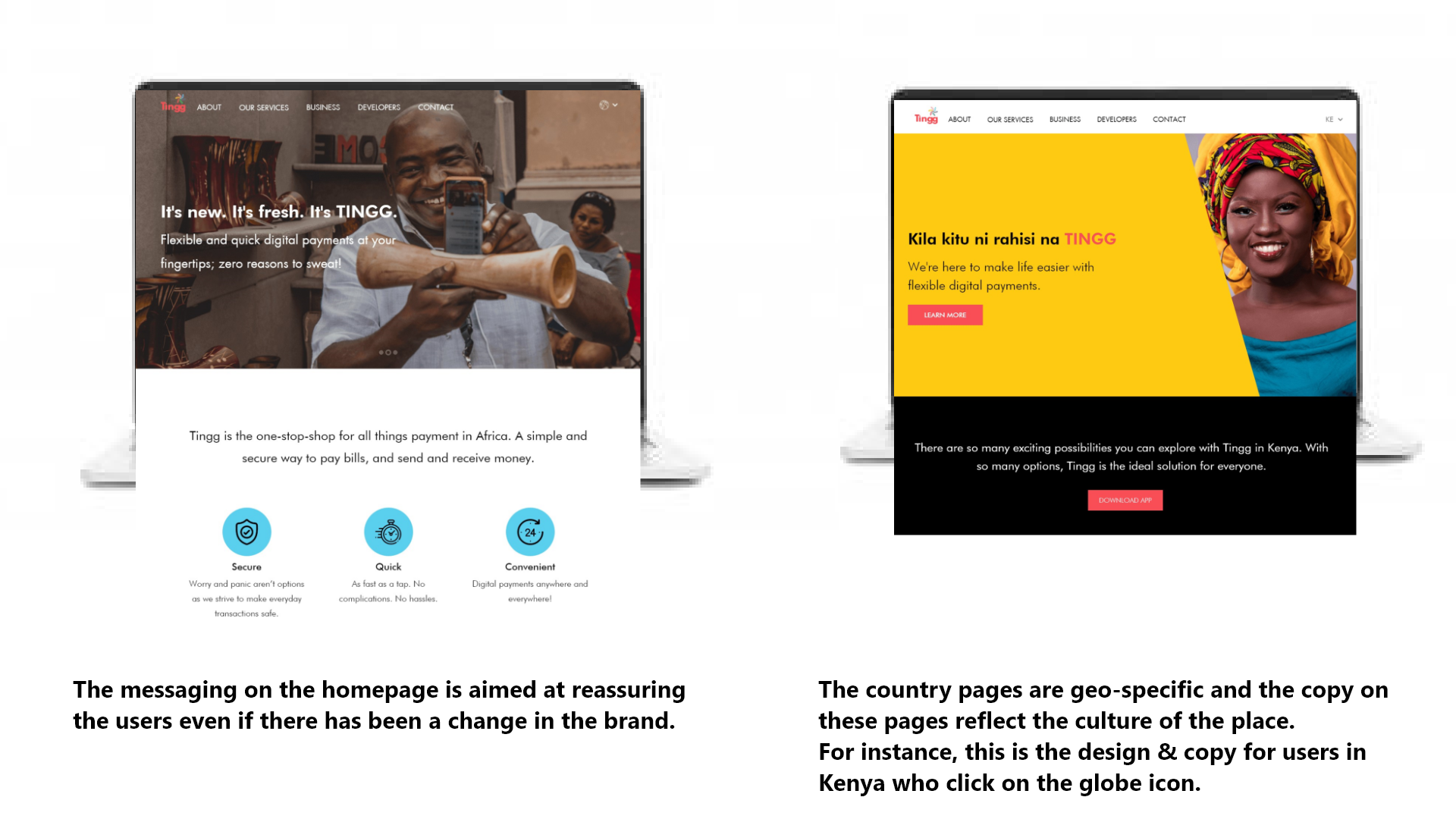
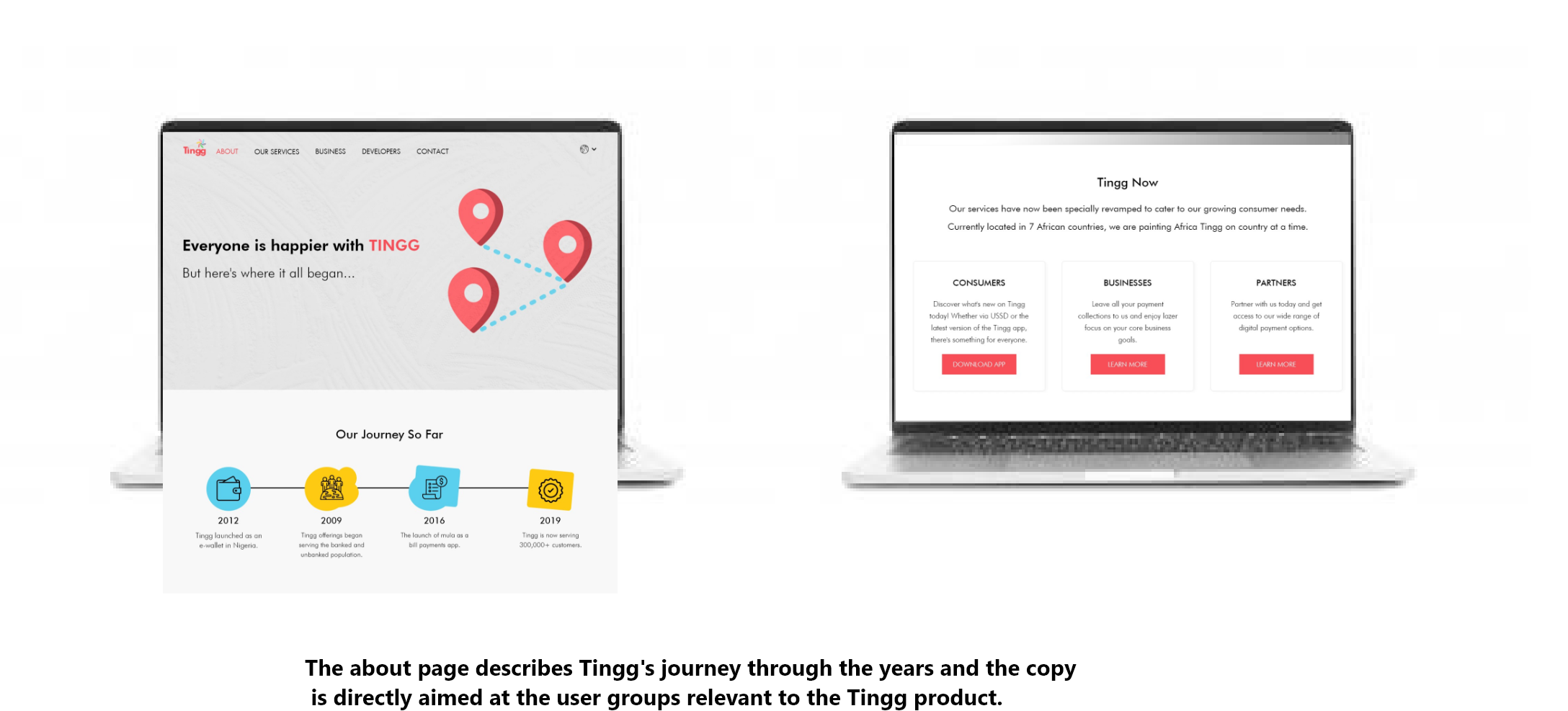
Our focus was on reassuring the users that the changes made to the app and brand were beneficial. Finding out that the unique value proposition varied across countries, these differences were highlighted in an easy-to-understand and visually appealing way.
The “Tingg Brand Guide” inspired the colour palette and design choices.
We held a brainstorm session and consolidated ideas for the information architecture and site map. As soon as we agreed on wireframes, we assigned each member of the team, tasks. I was responsible for writing the micro-copies and Ariyike and Debbie handled the UI design.
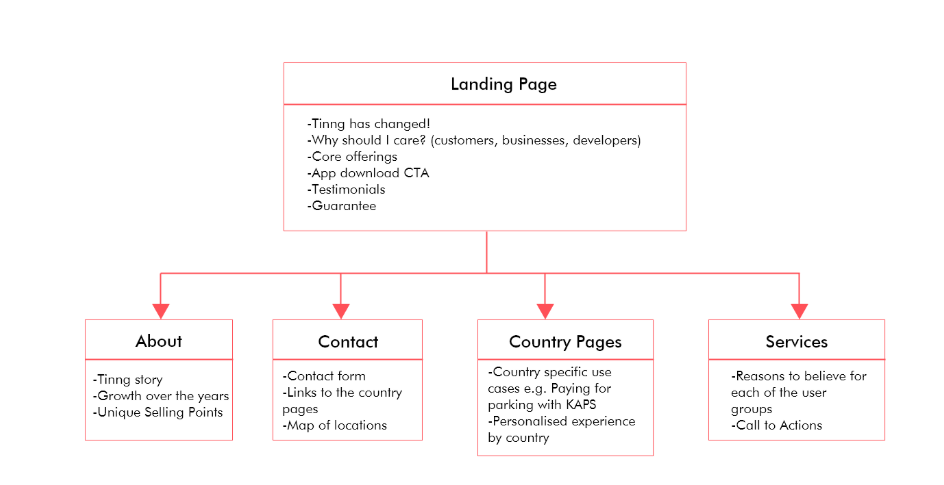
Site map
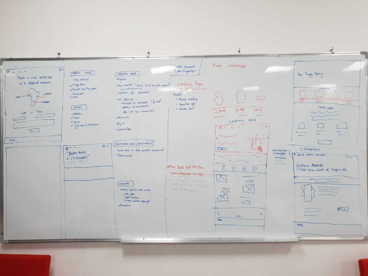
Wireframes
The following are ways to improve on the design given a longer time frame:
1. Conduct primary research to better understand the user needs.
2. Design a mobile-friendly prototype as the primary users use their phones for surfing the web.
3. Develop a dynamic hi-fi prototype to show interactions with the website.
4. Test our prototypes with actual users and iterate our design based on insights gathered from observing the users.
5. Based on the feedback received, it was recommended that we incorporate more of Tingg’s features on the “our services” page for instance, lending, virtual cards, checkout etc. The decision we reached was to incorporate this in the next iteration.